Modern word processing software has given us access to dozens, or even hundreds, of different letter forms. With a couple of keystrokes, amateur printers can dramatically change the look and feel of any publishing project. For most of our history, however, the appearance of the alphabet that one used was highly determined by regional, linguistic, and cultural factors. Type fonts grew out of calligraphic styles and changed only gradually over time. Type designers often prided themselves on avoiding innovation and imitating most closely the ancient styles, which they believed dated back to the Romans.
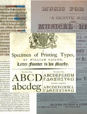
This exhibit will look at the origins of Gothic, Roman, and Italic typefaces in medieval manuscript pages and early printed books, highlighting the contributions of early printers and type designers like Jenson, Garamond, Griffo, and Aldus and the later adaptations of Bodoni, Baskerville, and Caslon. It will also feature the use of type in advertising and other forms of display in the 19th and 20th centuries as well as the conservative impulses and experimentation of the fine press printing movement.